- Updated:
- Published:
How daily granularity in Blask changes operator and affiliate decisions
Daily Blask data gives operators and affiliates something monthly averages can’t: visibility into what is happening right now — not what happened last month.
Blask has always offered daily data for short time windows. The bigger change was extending daily granularity to long-term historical data — the ability to look back across months or years not as smoothed monthly averages, but day by day
That shift changes how the data is used. It moves Blask from a reporting tool into a decision-support system.
When to communicate with players
Retention spend is expensive. Most of it lands at the wrong time.
An operator using Blask’s daily data can pull weekly and hourly activity patterns for any market and align push notification timing to actual player behavior. The data is market-wide, not drawn from a single operator’s funnel — which makes it valuable even for brands with limited first-party history.
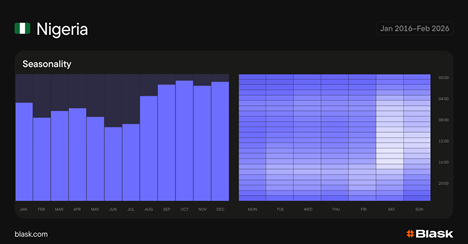
Blask’s analysis of five African markets published in February 2026 shows exactly how much timing varies. Nigeria peaks on Saturday, with a broad activity block that covers most of the day. Kenya concentrates into prime time with a pre-dawn tail. Egypt peaks after midnight, reflecting its Friday–Saturday weekend. A single cross-market communication schedule would miss the majority of demand in at least two of those five countries.
Industry benchmarks for iGaming push notifications put casino player peak hours at 7–11 PM local time, with sports betting messages performing best 2–3 hours before key events. Daily Blask data lets operators verify whether those benchmarks hold in their specific market — or whether local patterns diverge.
The practical question Blask answers: in this market, on this day of the week, are players more active in the morning or evening? Monthly data can’t answer that.
Tracking new brands — and how fast they grow
For affiliates, every new operator in a market is a potential partner. For operators, every new entrant is a potential competitor.
Daily granularity makes it possible to track not just whether a brand exists in a market, but when it launched — and how quickly it gained traction after launch. An affiliate can plot a new brand’s Blask Index from its first tracked data point and benchmark that trajectory against comparable brands in the same market.
Indonesia is the kind of market where this matters. The country’s Competitive Earning Baseline is high relative to the number of active operators — a sign of under-penetration that suggests more brands will enter. When a new operator launches there, daily data shows whether it gained momentum in days or months, and what ramp rate is realistic in that environment.
The same data works in reverse for trust assessment. A brand losing Blask Index steadily over six months, operating in only two countries, shows a risk signal long before it stops paying. One documented pattern from operator research: brands that later defaulted on affiliate payments were already showing consistent daily downtrends for months before the problem became known. Affiliates watching the daily chart had an early signal.
Deciding whether to buy traffic this week
Operators and affiliates face a recurring question when buying traffic: is this market worth spending on right now, or should I wait?
Monthly data can’t answer that. A monthly chart might show year-over-year growth while hiding a two-week downturn actively burning budgets.
Daily granularity makes the micro-trend visible. An operator can look at the last 20 days, see that demand has been declining since early April, and ask: is this a temporary dip or the start of something longer? Market Explanation adds the “why” — a narrative grounded in events, regulation, and market dynamics that explains what’s driving the change.
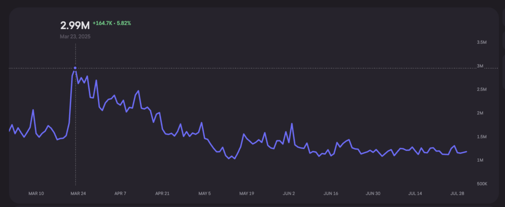
India during the 2025 IPL season is a good example of why daily precision matters. The opening day on March 22, 2025 produced a 49% single-day spike in the Blask Index — from 1.60M to 2.39M. But Blask’s historical analysis shows that peak engagement during IPL doesn’t land on opening day. The real spikes happen when India’s most popular franchises face each other mid-season.
Read more: IPL and Indian iGaming: an 18x growth story that repeats every spring
The paradox power users notice: India’s Blask Index can show a downtrend in April even while IPL is running. That’s because the event spike sits on top of a declining baseline. The daily view shows both — the seasonal boost and the structural trend underneath it. Monthly aggregation collapses the two into noise.
Annual events, day by day
The IPL case applies to any recurring event that affects a market.
Daily granularity lets operators reconstruct previous years day by day during peak periods. When did the Blask Index start rising before the tournament? How long did elevated demand last after the final? Were there visible dips on rest days, and how deep were they?
Those shapes repeat. Knowing the curve from previous IPL seasons gives operators a template for campaign timing in the current year — where to place media spend, when deposit conversion is highest, when to pull back. Over eight seasons, iGaming activity around the IPL start has grown more than 18-fold in India. Daily data makes it possible to analyze how that growth distributed across the tournament window.
Seasonality outside the sports calendar
Some seasonality has nothing to do with sports.
In several Sub-Saharan African markets, agricultural income cycles affect gambling activity. During harvest periods, disposable income rises and betting volume follows. Outside harvest periods, engagement falls even when no sporting event explains the drop. An operator running the same traffic volume year-round spends money against an audience with less capacity to convert.
Blask’s Customer Profile data shows the occupation and income structure of a market’s player base. When combined with daily Blask Index data, it lets operators connect what they see in demand trends to what they know about who their players are — and what drives their economic behavior. A mid-year trough that coincides with a predominantly agricultural economy isn’t an anomaly. It’s a predictable pattern that daily data makes legible.
Long-term competitive analysis, one day at a time
Monthly competitive data shows which brands gained or lost share. Daily data shows exactly when.
If a competitor’s BAP jumps 3 points in a single week, something specific happened: a campaign launched, a sponsorship went live, a rival was removed from the market by regulation. Monthly data buries that event in an averaged number. Daily data isolates it.
Operators can reconstruct a competitor’s playbook by looking at when their Blask Index spiked and what those spikes correlate with. That analysis isn’t guesswork — it reads the behavioral record backward from outcomes.
The same logic applies to monitoring market concentration. In markets where one or two brands hold 70% or more of BAP, daily data shows whether that concentration is stable or eroding. A dominant brand losing 0.5 points of BAP per week over three months is a different signal than one that’s flat. Monthly data shows the three-month outcome. Daily data shows when the erosion started.
Daily data doesn’t change what Blask measures. It changes how quickly users can respond to what they see. A monthly average tells you what happened. A daily chart tells you when it started — and leaves enough time to act.